


A personal dare from Marina Abramović, and other unforgettable reds of art and fashion history
How red defined Mark Rothko, Niki de Saint Phalle, Henri Matisse, Donald Judd, and Diana Vreeland.

❥ This email may be truncated in your inbox. To make sure you are reading the entire post, please move yourself along to a web browser!
More from me + Absolument can be found in these places:
Website | Instagram | Shop Absolument | Book Recs - Merci, thank you tons and tons for reading!
When performance artist Marina Abramović examined me shortly before signing my copy of her autobiography, Walk Through Walls, she told me two things. Her Russian accent dug into me: “Are you Balkan?” A pause with intense eye contact. “I can see it in your eyebrows.”
I’m not—or at least I don’t think so—I’m sorry.
The second comment: “It’s a sign of protest for women to paint their nails red. Keep protesting.” For years, I always painted them a brilliant red, although they were often chipped from my mid-twenties anxiety.
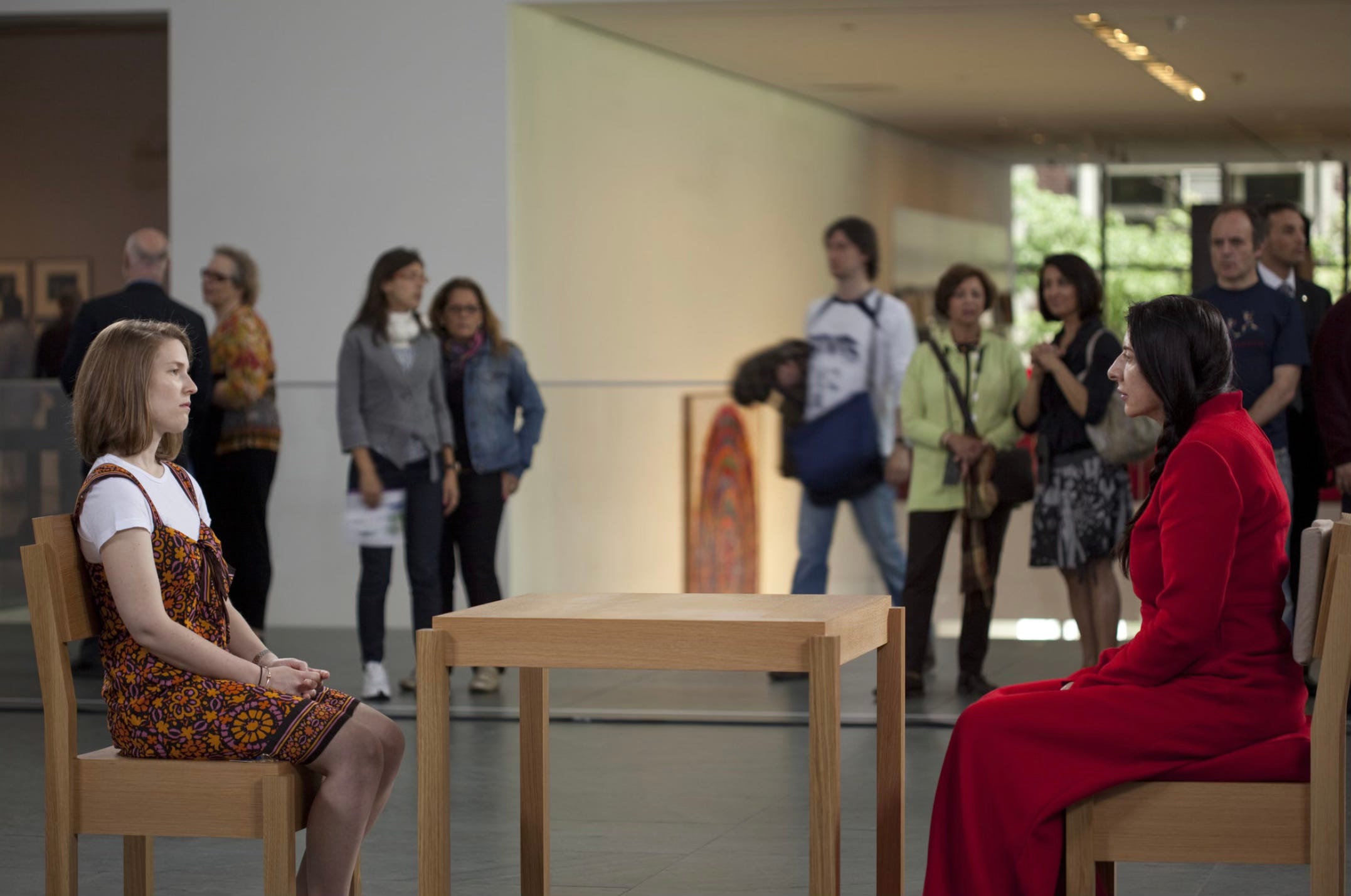
Suspended in her firm words, I was like a late guest to her 2010 three-month-long performance at MoMA, The Artist is Present. She stared at me in a trance. I, looking back, with eyes underneath faux-Balkan eyebrows. (A few years later, I learned, thanks to Ancestry.com, that my DNA is 3% Balkan, and the intensely shaped brows were just a 26-year-old’s misuse of a too-dark eyebrow pencil.)
Marina wore black that day during this lecture and book signing at the Getty Museum, but I could only envision her in the long, impossibly red gown that she donned each day at MoMA.

Red has been my favorite color for as long as I can remember. Marina confirmed the color’s power for me almost a decade ago, and the people below continued to solidify it along the way. Let’s see how it has popped up in art and fashion history!
Diana Vreeland’s red-drenched style
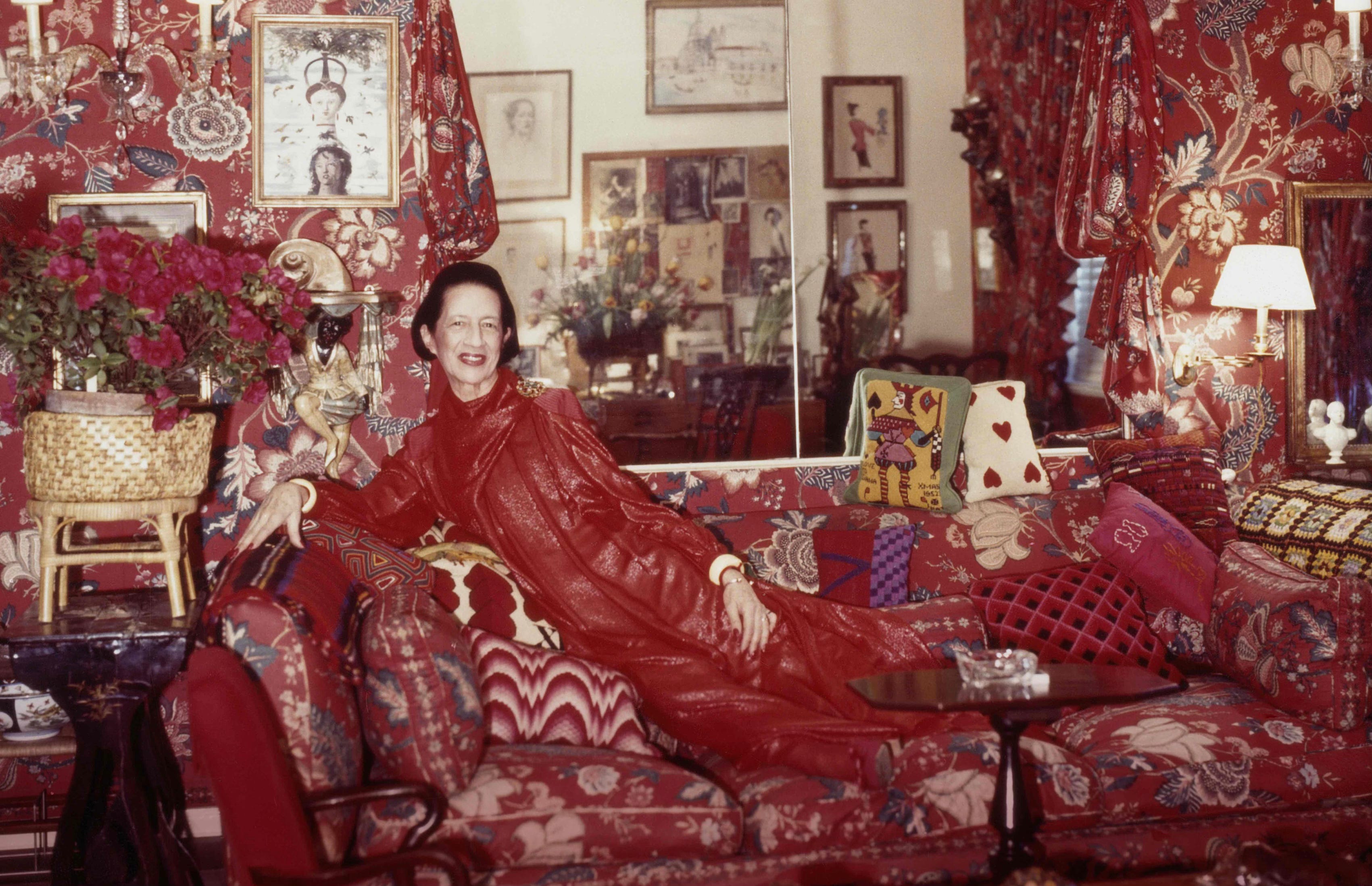
Diana Vreeland relaxed at a forty-five-degree angle on her jacquard-patterned couch, which was the same pattern as the room’s wallpaper. The couch and walls were both red, and surprisingly, the sofa was also layered with her red-adorned body. Her lips were painted red, outlining a large grin. A bouquet of red flowers toppled out of a woven basket behind her, and various accessories of the same hue were dotted throughout.
Famed photographer Horst P. Horst captured this moment on camera in 1979. Later, there was a documentary about Vreeland called The Eye Has To Travel, which is exactly what happens when viewing this red-centric photograph.
Vreeland had first been a columnist-turned-fashion editor at Harper’s Bazaar, a career lasting from 1936 until the early 1960s. Toward the end of her tenure with the magazine, in 1955, Diana hired interior designer Billy Baldwin to drench her New York apartment in red. Then, she jumped over to Vogue, where she was Editor in Chief. Vogue fired her. Eight years later, at the time of this portrait, Vreeland was consulting for The Metropolitan Museum of Art’s Costume Institute. Her office at The Met was characteristically as red as her home.
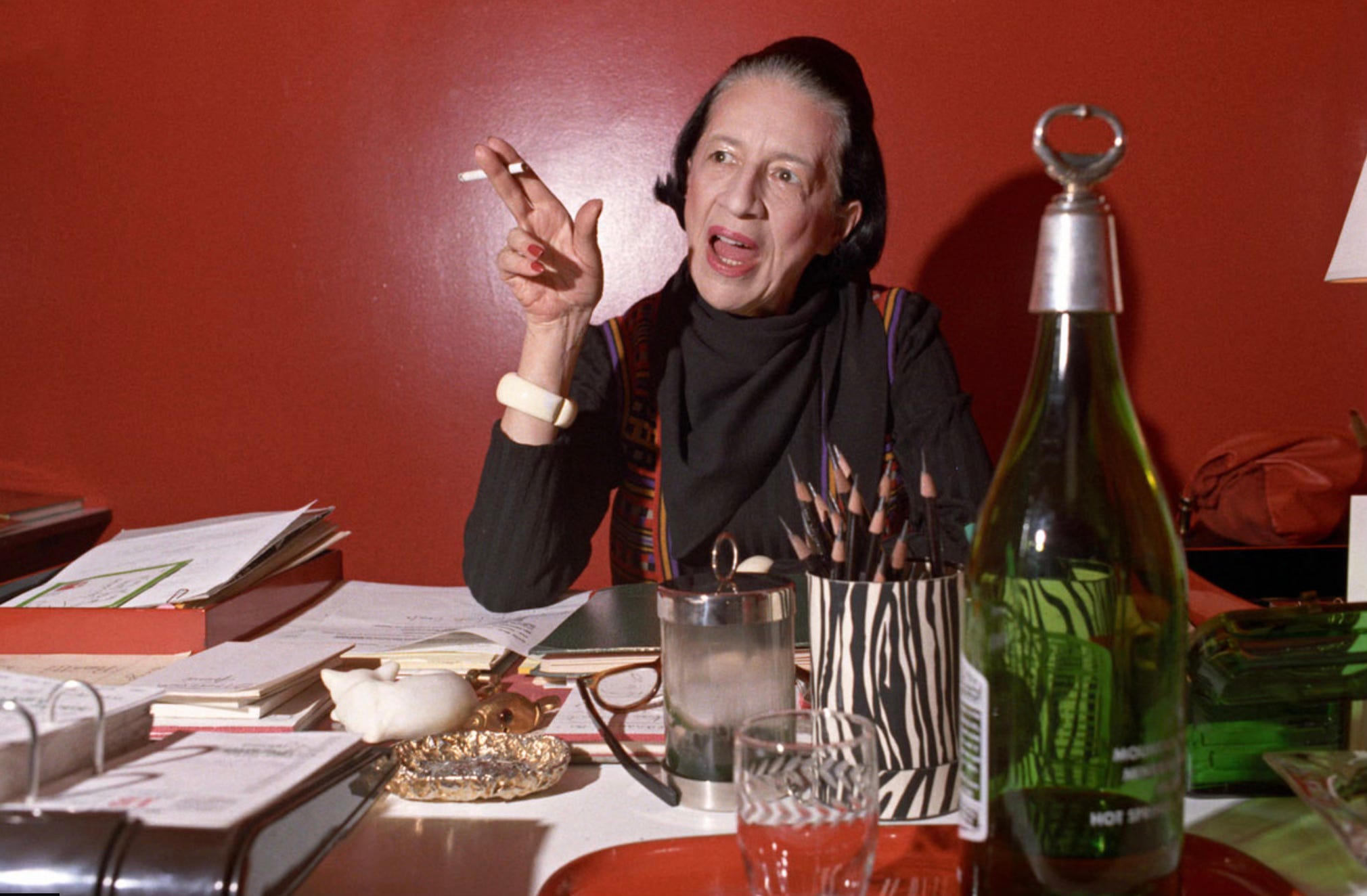
She declared in an interview, “Red is the great clarifier: bright, cleansing, and revealing. It makes all colors beautiful. I can’t imagine becoming bored with red—it would be like becoming bored with the person you love.”
This particular opulence reminded me so much of my takeaways after spending a week in Venice. The interior lining of the gondolas, some of the heavy curtains covering the windows of palazzos, the luxury of a pleated Fortuna silk dress in a shop window, and the crimson of the jam in my morning cornetto. Was I noticing the color because it was my preferred one?
The Fashion Institute of Technology wrote Red Craze as an explanation for fashion history’s adoration of the first color of the rainbow, especially in Venice:
“Among the most important producers of red dyes was Venice, a wealthy republic that made its fortune through trading, including the precious kermes. The deepest and most resplendent reds, collectively known throughout Europe as ‘Venetian scarlet’, were the envy of all who saw them. The city was known for the manufacturing of the most magnificent textiles and the production of a considerable variety of reds, among them the famous Venetian scarlet–the generic name for all the luxurious reds–whose recipes were staunchly protected by state secret.”
The Red Studio by Matisse
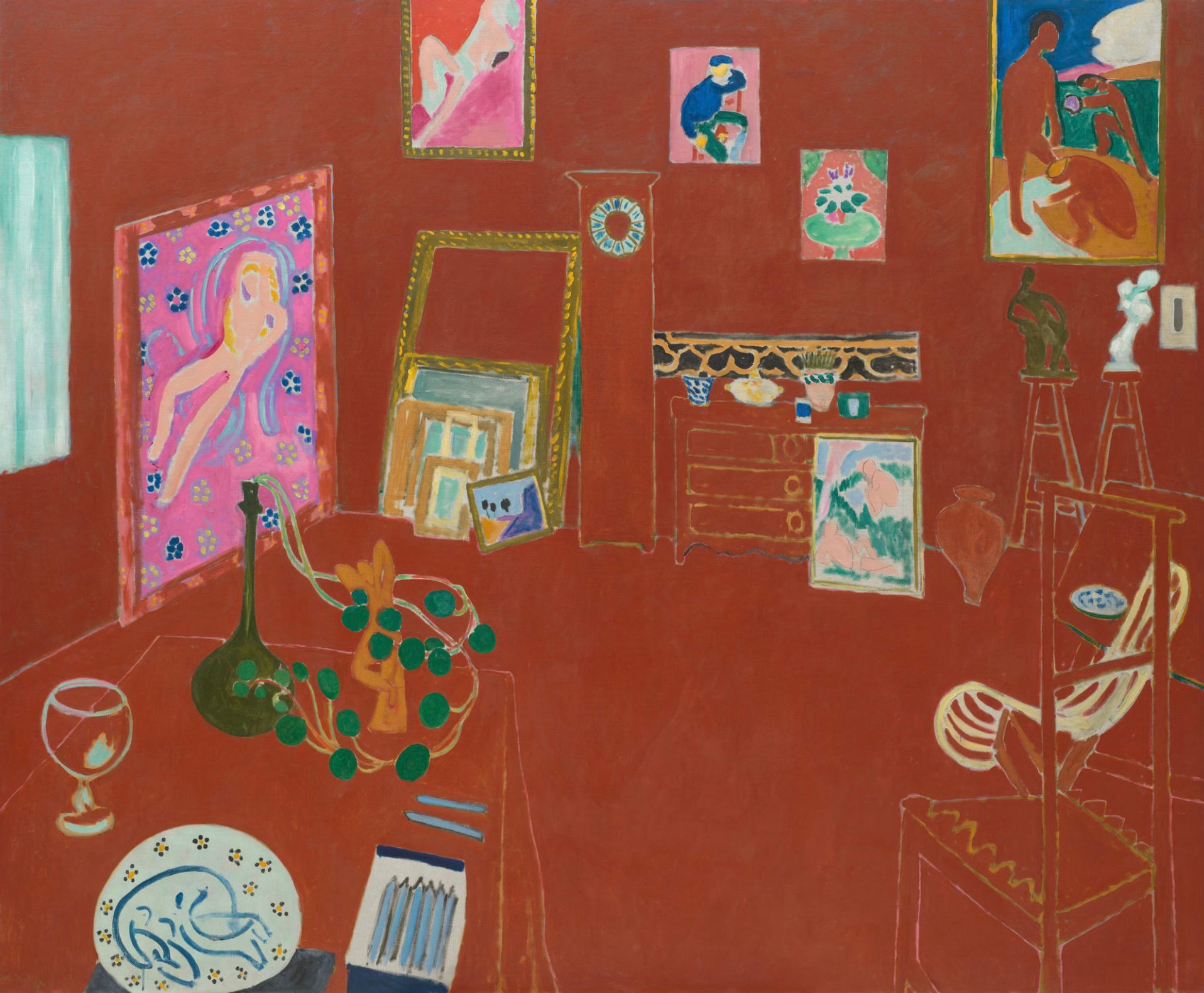
In March of 1966, ARTFORUM singled out Matisse in Matisse and the Strategy of Decoration. “Simply his responsibility for exposing modern eyes to a new vernacular of color, specifically to the illimitable and enervating possibilities inherent in the juxtaposition of high-keyed hues, rather than dark against light, was enough to establish his pervasive influence, though the directions of this influence were as curiously diverse as modern painting itself.” Nancy Marmer, the article’s author pointed to “the monumental treatment of flat glowing areas of pure color.” One of his most well-known paintings, The Red Studio, fits this description perfectly!
At the time of its painting (1911), a room was never depicted as having such undefined space. The ceiling, walls, floors, and furnishings are all the same flattened shade of red. And yet, there’s still a sense of knowing exactly what the architecture of the room looks like. It’s a massive artwork. We’re there in the space ourselves, and somehow it makes sense.
MoMA, which owns the painting, shared some words from Matisse: "Where I got the color red—to be sure, I just don't know. I find that all these things only become what they are to me when I see them together with the color red."
Donald Judd’s Cadmium Red Untitleds
I briefly mentioned Donald Judd’s Cadmium Red affair here:

The Donald Judd Foundation shared a segment of a 1971 interview with the artist:
“I thought for a color it had the right value for a three-dimensional object. If you paint something black or any dark color, you can’t tell what its edges are like. If you paint it white, it seems small and purist. And the red, other than a gray of that value, seems to be the only color that really makes an object sharp and defines its contours and angles.”
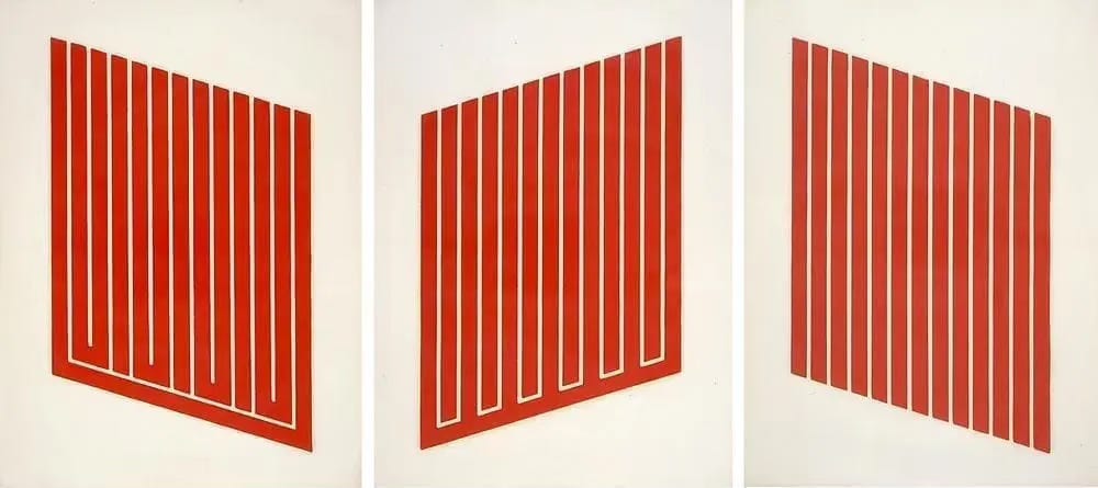
He exploited this cadmium red color in different forms: mostly in print making and sculptures made either of wood, acrylic, or aluminum. He’s completely right—the cadmium red creates an exaggeration of form. An intensity!

Engulfed in the emotional reds of Mark Rothko
Rothko is an artist who has a spectrum of fans—some know nothing and others know everything. What everyone does know is that his paintings are excellent at stirring up our emotions. It’s all anyone seems to talk about when Rothko is brought up!


Christie’s describes the phenomenon:
“A preeminent figure of postwar art, Rothko spent much of his career translating the emotional language of color, perhaps most famously in his ongoing fascination with red. . .For Rothko, color—no matter how striking—was always a means to an end. Namely, to voice the language of the emotions. ‘Ecstasy’ ranked high among those feelings, as did ‘tragedy’. Likewise, color per se struck him as merely decorative: his preferred expressive term was ‘measures.’ Measures are to color, what scale is to size. Not an inhuman fact but, rather, felt time and space.”
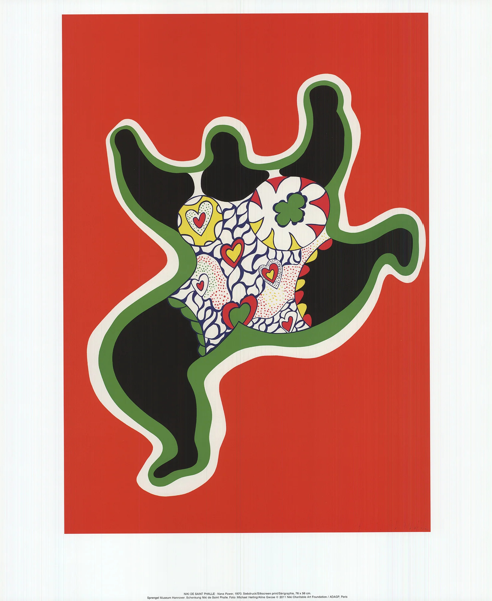
Niki de Saint Phalle’s Red Nana
Niki de Saint Phalle is an idol for me. If you know about her backstory, she was an American citizen who also happened to be born in Paris. So, she was biligual and bicultural. Niki began her art practice in the 1950s and was completely unlike the archetype for women at the time. Her “Nana’s” series ('“nana” is a slang word for “woman” in French, but not totally derogatory) shows large, often bulging, colorful women suspended in a bout of energy and rebellion. Red, of course, is often linked to these two things, and happens to be a primary de Saint Phalle feature.
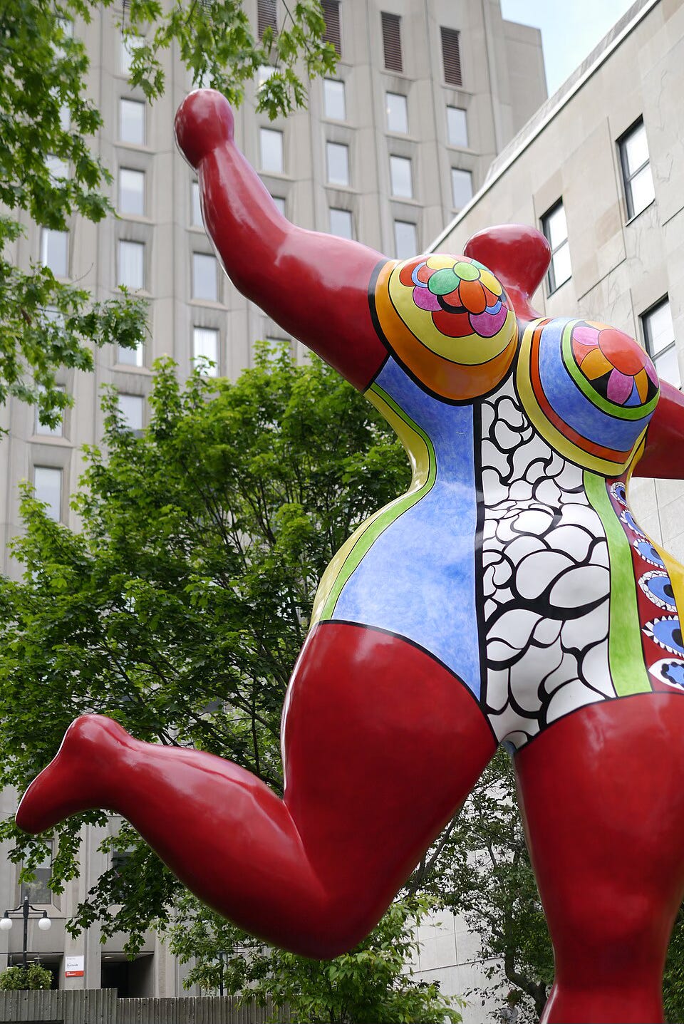
Curator Ruba Katrib at MoMA PS1 described her Nanas in the below video, saying that, “[de Saint Phalle] endowed them with a certain power, calling upon female goddesses from history and antiquity. She was envisioning a matriarchal society, and so she was plotting out a way that these Nanas could take control over the world.”
Related Notes:
“Caravaggio” should automatically be synonymous with a particular shade of red. Can we start this trend of using Caravaggio as an adjective?
The Met has a downloadable PDF of its publication Cochineal Red: The Art History of a Color, which displays wondrous examples of the hue in the Museum’s textile collection. It’s so fascinating to see the color span from Mexico’s dye baths in the 1520s to Incan garments of the 1700s to Louis XIV and more. I can’t wait to read all of the juicy details of Marina’s (and my) favorite color.
This Edvard Munch painting is full of drama, including the color theory behind everyone’s clothing and hair colors.
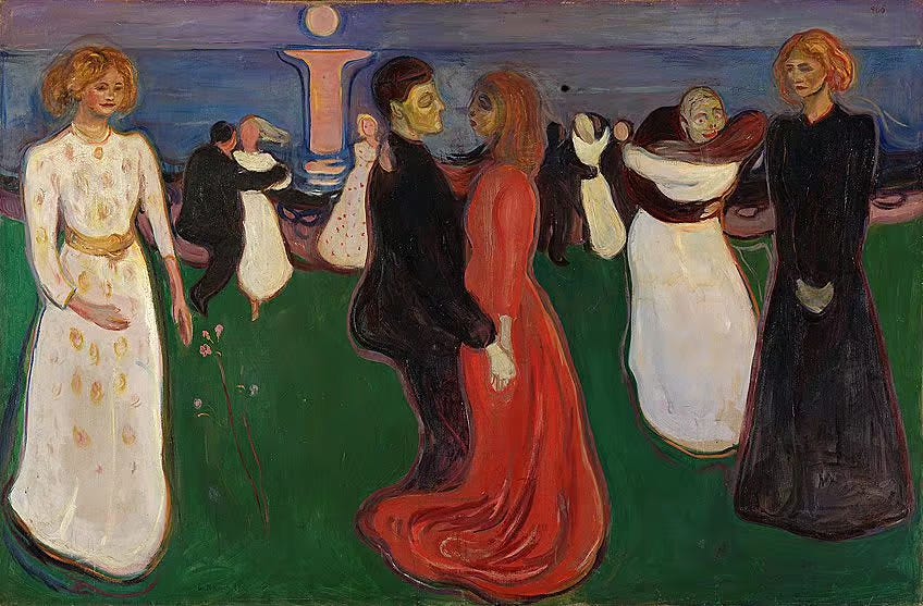
The Dance of Life, Edvard Munch, 1899. Niki de Saint Phalle’s Tarot Garden in Garavicchio, Tuscany, Italy, from the late 1970s shows glimmers of red, mirrored mosaics, and her recognizable cast of characters.


Tarot Garden in Italy is a dream trip for me—anyone want to join?
**
Kelsey Rose
Loved this exploration of red featuring so many of my favorite artists! And you absolutely must go to the Tarot Garden — I had a transcendent experience there a couple years ago and reflect on it often. You'll love it!
Really wonderful. I thoroughly enjoyed this thanks.