I began researching specific artists and the colors they are widely identified with and quickly realized during the plunge down this colorful rabbit hole that the histories had another strong point in common. Each of the artists have had their color stories connected with the sense of sound.
I’m currently reading Olivia Laing’s Funny Weather: Art in an Emergency and skipped backward to reread the chapter on Robert Rauschenberg (the chapter is called “For Yes” which totally parallels the meaning behind my naming of Absolument). Laing describes Rauschenberg’s studies under color theorist and Bauhaus instructor Josef Albers, and Robert’s series of “White Paintings” and “Black Paintings.” Laing writes:
“By applying white house paint with a roller, Rauschenberg deliberately avoided incident or gesture. They were pure surface: the first and most extreme manifestation of Rauschenberg’s conception of art as a mirror for capturing the outside world. Look long enough, and you’d start to see shadows and reflections; the absence-that-wasn’t which inspired [John] Cage to make 4’33”, his famous composition that deploys silence to expose a symphony of random ambient sound.”
One act of rebellion that I remember from a modern art history class in university was learning about Rauschenberg’s Erased de Kooning Drawing in which he did just as the title suggested. He was given a drawing by de Kooning and then completely erased it, leaving behind an empty canvas with a distinct hue of silence.
Le Corbusier's Keyboard of Colors
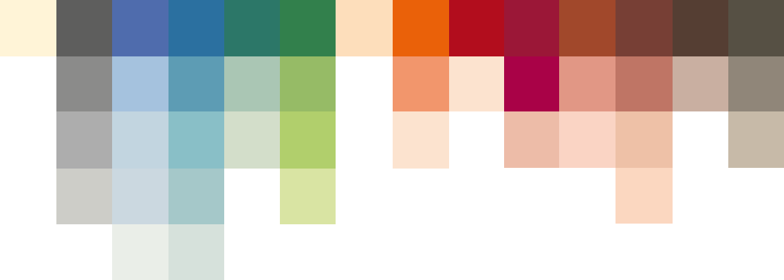
In 1931, Le Corbusier wrote the manuscript Architectural polychromy—study for architects by an architect [involved, by the way, in the adventure of contemporary painting] (translated from French). He explained, “color modifies space, classifies objects, stimulates physiological reactions, and has a strong effect on our sensibilities.” That year, he created the “Claviers de couleurs,” the Keyboard of Colors. On this piano, you’ll find 14 hues fanned out to lighter variants, completing a set of 43 distinct colors.
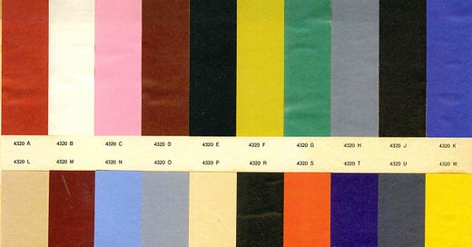
Nearly three decades later, in 1959, Le Corbusier created a second set of 20 shades (that I can’t take my eyes off of).
Then, he explained further his thoughts on polychromy and color’s link to architecture:
“You divide up the habitable spaces into compartments as you see fit, according to gestures that are useful to quotidian behavior and that are linked by independent circulation systems. This gives you the free plan. Once the mason has finished his work, it is this free plan that gives you walls that appear incoherent at first glance. They are gray or white, depending on the circumstances, and then you might find that this scheme created monotony, which might bother some people, although I myself am not in the least bothered by it, as I find white agreeable. But, in any case, you resort to using color to arrange things according to an order. You classify and put events into hierarchies, you give them purposes.”
Les Couleurs Suisse AG has the license to Corb’s keyboard, and you can explore each of the individual shades in depth on their site. There’s an exercise where you can slide along the color scale and it really does feel like you’re playing the piano. It’s a brief moment of imagining what it must be like to have synesthesia. I can almost hear what the transition from “terre sienne brulée” sounds like as it slides into “noir d’ivoire” and then into “vert olive vif.”
PS - Here’s a wonderful example of Le Corbusier’s keyboard in action at his Maisons Jaoul, a pair of homes outside of Paris.
The Eames “Greige”

Charles and Ray Eames named one of the first hues of the Eames fiberglass Armchair and Side Chairs “greige”—a combo of grey and beige. This is different than the soul-less grey/beige interiors trend that has overwhelmed the entire world. Greige has spirit! Charles and Ray created a film called Kaleidoscope Jazz Chair in 1960, which, in some scenes, sprinkles fiberglass chairs across the screen in stop-motion fashion along to the sound of jazz music. Greige makes a plentiful appearance.
Yves Klein’s International Klein Blue
Close to Le Corbusier’s keyboard note 4320K “blue outremer”—yet packed with more vibrancy—is Yves Klein’s International Klein Blue. “Blue has no dimensions, it is beyond the dimensions of which other colors partake,” declared Klein, after being inspired by philosopher Gaston Bachelard’s words about the color. And there we have it: another French guy with serious things to say about color. Bachelard noted, “First there is nothing, then a depth of nothingness, then a profundity of blue.” Can you imagine the sound attached to that depth-of-nothingness-type-of-blue?
I urge you to read more about Klein’s other inspirations, his scientific mixings of various binder solutions to achieve the pigment, and his performance art involving nude women. Spoiler alert: this performance was referred to as a symphony, which, like Le Corbusier, gives a musical quality to his use of color.
“Klein’s Monotone Symphony: twenty minutes of one continuous sound, ‘deprived’ of beginning and end, and twenty minutes of silence. Under Klein’s direction and before his eyes, the artworks took shape without his touch. He was conductor or director as much as painter, as the blue paint covering the women’s bodies transferred to the canvas with no intervening brush, roller or other artists’ tool."
**
Related notes:
One can’t write about music and color without mentioning Wassily Kandinsky. “The sound of colors is so definite that it would be hard to find anyone who would express bright yellow with bass notes or dark lake with treble.”
There’s a Rothko exhibition happening at the Fondation Louis Vuitton in Paris, featuring 115 color blocked works, through April 2024.
Speaking of synesthesia, when exploring Le Corbusier’s keyboard above, did anyone else think of Neapolitan ice cream when hovering over the “blanc ivoire”/“rose vif”/“terre sienne brulée” combo at the beginning? I could go for a scoop of that right about now.
Donald Judd describes how Cadmium Red was the color in his artistic experience that helped define angles and form the best.
A few years ago, Anish Kapoor licensed the sole use of VANTABLACK, the darkest matter in existence, to use as the pigment in a series of artworks. It’s a material that absorbs 99.965% of visible light. These works are practically black holes. You can see this phenomenon with your own eyes in New York’s Lisson Gallery right now.
Have a colorful week, and please refrain from bringing any erasers to an art museum.
Au revoir,
Kelsey


PS - I found a fun fact about Yves Klein while stumbling upon an online shop (HouseandParties.com) in one of Ali LaBelle's gift guides. "In 1958, Klein held an exhibition in Paris to introduce his color, and to the surprise of visitors, the gallery was empty and white. As it turns out...his guests went home to urinate blue because of the methylene blue that was in their cocktails."
loved this deep dive! thank you